Desinova Studio
Visual Identity & Web Design
The Challenge
Desinova Studio was growing fast but lacked a strong digital presence to match its ambition. Their existing site didn’t reflect their design capabilities or communicate their vision clearly to potential clients and investors. They needed a professional, compelling platform to attract new projects and support future investment opportunities.
Outcome
I designed a bold, modern website that positioned Desinova as a forward-thinking design studio. With a refined visual identity, strategic messaging, and a flexible content structure, the new site now highlights their work, values, and team in a way that resonates with both clients and investors, setting the stage for their next phase of growth.
My Role


A living Studio
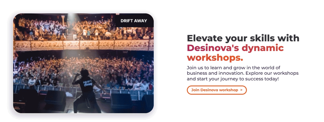
We wanted to create more than just a website, we aimed to build a dynamic, living platform that felt connected, expressive, and alive. To bring that vision to life, we focused heavily on thoughtful interactions and animations, using them not as decoration, but as a way to guide attention, evoke emotion, and reflect the studio’s energy and values.
I carefully designed motion triggers across scroll, hover, and load states to make the interface feel responsive and fluid in Webflow. These subtle yet intentional details helped transform the site into an engaging experience, one that mirrors Desinova’s evolving, system-driven approach and resonates with both clients and potential collaborators.
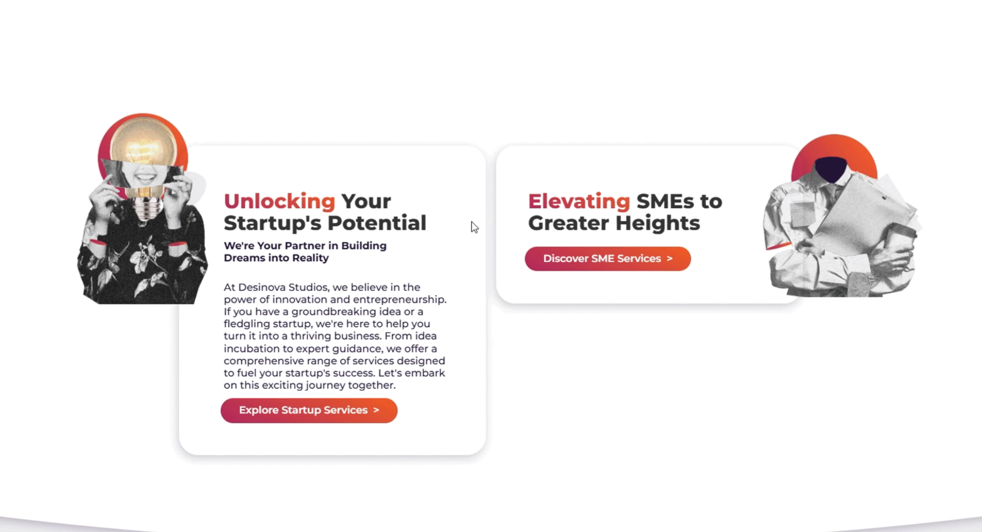
I designed two characters inspired by the user personas identified in earlier stages of the design process. These characters served as narrative anchors and were used to categorize and structure the services, becoming an integral part of the information architecture and enhancing clarity and engagement.
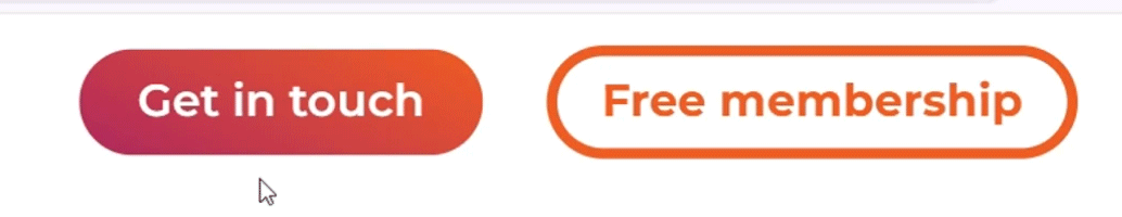
To highlight key sections of the website and make them easily accessible from the homepage, I also used interactive elements to both communicate their purpose and encourage exploration.
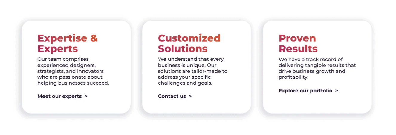
Presenting the team and services was no exception, I used interactions to highlight content, invite exploration, and reveal relevant information in a dynamic, engaging way.
Discovery phase
The process began with a briefing session. While I was already familiar with Desinova Studio’s vision, we used this meeting to dive deeper into what the team wanted to communicate, their vision, services, audience, content strategy, functional requirments, tone and personality of the brand.
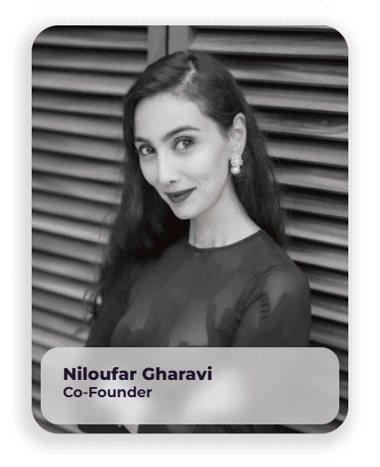
The studio was run by three people with backgrounds in business, project management, entrepreneurship, and service design, so I took the lead as the design expert, translating their vision into a clear, engaging, and functional website.
Following the briefing, we mapped out potential users by creating personas based on the different profiles within the Desinova ecosystem, including investors, startup founders, professionals, students, experts, and ideators. Each persona represented a unique set of needs and services.
Through this process, we identified two overarching categories that could encompass all our user types (SMEs and Startup). This strategic grouping helped structure the information architecture, allowing us to organize services accordingly and present relevant content to each type of visitor as they navigated the site.


We created a service map during the briefing session, exploring the studio’s different offerings and identifying their target audiences. This was a crucial first step in understanding how to structure the information architecture in a way that clearly connects each service to the right users.

Definition Phase
After defining the user types and categories, I developed the information architecture of the site to reflect their needs and Desinova’s service pillars. This resulted in a structured sitemap with 20+ subpages, including services, about, blog, workshops, podcasts, and portfolio sections.
Somethimes designin is messy
the process was far from linear, and intentionally so. Early on, I developed some initial graphic elements that helped set the tone and direction for the brand. The CEO is very sensitive and visual, so it was a good way to connect ideas. The visual identity and information architecture evolved in parallel.
While mapping the site’s structure, I also explored different logo, typography, and layout directions, aiming to strike a balance between professional trust and playful innovation. This flexible systemic approach allowed the visual language to shape how content was organized and experienced, resulting in a design that felt both intentional and alive.


Exploring a new logo
I began by mapping out key concepts that emerged during the briefing process. After conducting a competitive analysis, I intentionally avoided visual clichés, such as connected dots to represent "connection", in order to create a more original and meaningful brand expression.
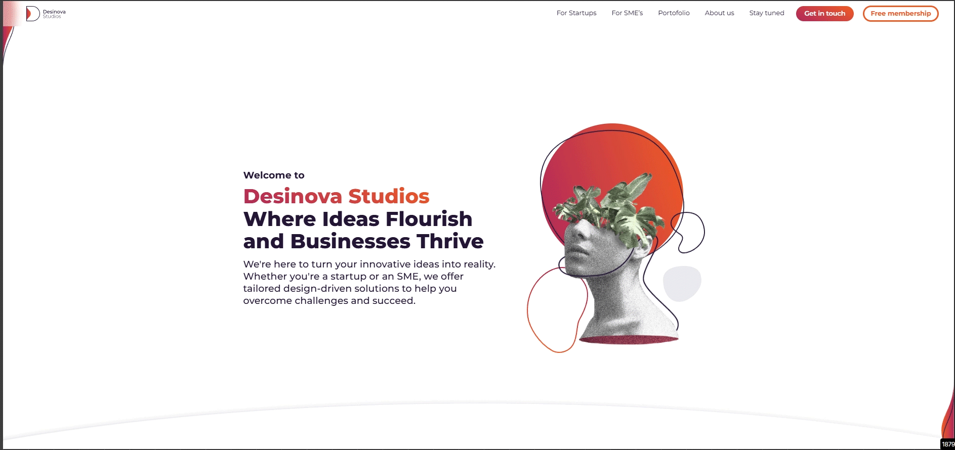
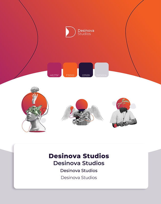
For the logo, after multiple explorations, we landed on a bold, minimalist sans-serif “D” as the foundation. Inside it, a fluid, gradient-filled shape shifts and evolves, symbolizing transformation, creativity, and adaptability. The contrast between the structured outer form and the organic interior reflects Desinova’s core identity: systemic design with a living, evolving essence.


Design phase
Once I defined wireframes and UX was approved, I moved into further developing the visual identity system. I created a custom logo that reflects interconnectedness and growth, a modern color palette with digital-friendly hues, and dynamic illustrations that bring the brand story to life.
I the applied this visual style to the website. I designed every screen from wireframes to final high-fidelity pages (fFigma) and prototypes (Webflow). I focused on:
-
Clean, grid-based layouts that support easy navigation across large volumes of content.
-
Micro-interactions and scroll-based animations to tell the story of Desinova's impact and methodology in an engaging way.
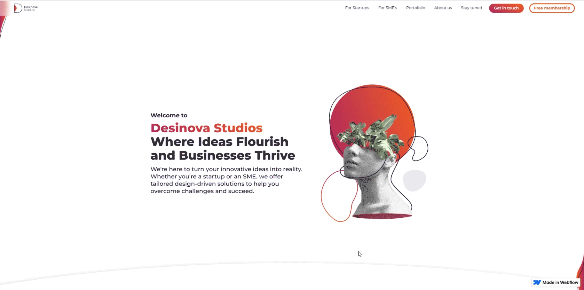
The website includes a full set of pages. The home section features a unique, flexible layout designed to capture attention and express the brand’s personality, while the inner pages follow a more structured, grid-based system that supports easy navigation and facilitates development.

The information architecture allowed us to organize all content under a clear, condensed navigation bar with dropdown menus that include images and well-structured links for easy access. The interactive menu design not only serves a functional role as a selector but also reinforces the brand narrative evoking fluidity and movement while guiding users through the site.

Usability tests and new features
During usability testing, some users found the homepage too long, making it hard to navigate or know where they were after scrolling. To improve this, I introduced several interaction enhancements:
-
A sticky menu bar that hides on scroll down and reappears when scrolling up, keeping navigation accessible without cluttering the view.
-
An "arrow up" button that appears when scrolling up, allowing users to return to the top with one click.
-
Side scroll indicators that replace the browser scrollbar, showing progress and helping users orient themselves on the page.
These changes made the experience more intuitive, fluid, and user-friendly.
The website was designed with responsiveness in mind, ensuring a smooth experience across different screen sizes. I created a flexible layout system using consistent spacing, scalable components, and adaptive typography. Key elements were carefully adjusted for mobile and tablet views to maintain clarity, usability, and visual impact on every device.