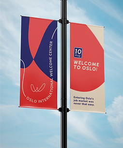
Oslo International Welcome Center
The Oslo International Welcome Center (OIWC), an initiative by Oslo International Hub and supported by Oslo City Hall, was created to help international professionals integrate into Oslo’s job market and professional ecosystem. With no existing visual identity, the organization needed a brand that felt welcoming, professional, and inclusive, and could communicate their services clearly across both digital and physical platforms.
As the lead designer, my role was to create the visual identity from scratch, aligning it with OIWC’s mission and audience. I followed a Double Diamond design process, starting with a briefing session to understand their vision, audience types, integration strategy, and communication needs. I then conducted visual benchmarking to explore best practices and define a unique, relevant visual tone.
Through a collaborative strategy session, we defined the brand’s purpose, core values, and personality. This strategic foundation guided the development of a flexible, modern identity system, complete with logo, color palette, typography, and visual elements adaptable across print and digital formats. The result was a brand that reflects the open, dynamic spirit of OIWC and supports its mission to connect newcomers with opportunity.


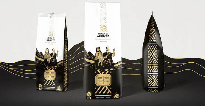
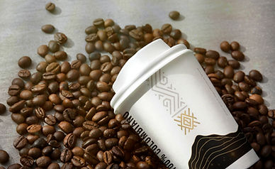
Inga de Aponte Coffee
I developed the brand identity for Café Inga de Aponte, a specialty coffee grown by the Inga Indigenous community in southern Colombia, in partnership with the national program for victims of the armed conflict. The goal was to position the coffee for international markets while honoring its ancestral roots.
The visual identity centers on a traditional sun symbol from Inga clothing, representing ancestry (gold), sky and earth (black and white), and conveying both cultural meaning and premium appeal. To challenge stereotypes of Colombian coffee (like the man with a hat and mustache), I illustrated a man and woman in traditional dress set in the mountains, presenting the community with dignity and authenticity.
This brand tells a story of resilience, sustainability, and identity, offering the world not just great coffee, but a living legacy of Indigenous knowledge and craftsmanship.


Sabe Solutions
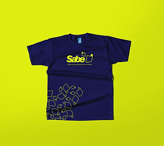
I developed the complete visual identity for SABE Soluciones, a Colombian brand that offers fast, secure, and transparent support for vehicle and driver-related procedures. “SABE” not only stands for Seguridad, Agilidad, Buena atención y Experiencia, but also means “knowing” in Spanish, emphasizing expertise and reliability.
My role included naming, logo design, and the creation of a cohesive visual system applied across print and digital formats. The symbol, a folded document forming a thumbs-up, captures both the administrative nature of the service and a sense of reassurance, making it highly memorable. The color palette was carefully selected to attract drivers actively seeking assistance and subtly references the visual language used by transit authorities in Colombia, creating instant recognition and trust. The result is a brand that is clear, approachable, and deeply aligned with the user’s needs in high-stress moments.